PURPOSE & UX
Oversimplification aside, the KW experience starts off like a “hotornot for research,” and quickly becomes much more.
[1] We help users to browse, engage with, and learn from research in a fun way — they rate (scoring out of 10) as they browse. Similar to the hotornot UX from the early 2000’s, users rate an abstract that pops up, whereupon it swooshes off the screen. Publication details and rating averages pop up on the left, and a new abstract replaces the old one.
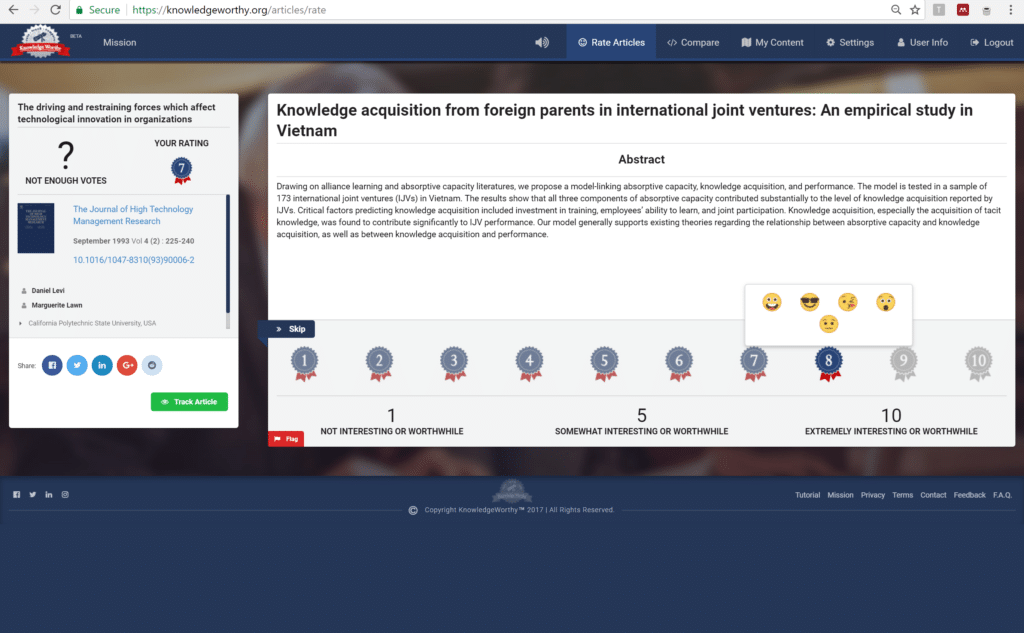
But upon rating an abstract, users also have the choice to delve a bit more deeply. They can track the abstract’s scoring, archive it in folders, share their ratings online, and even click on the article’s DOI link.
What’s important here is that, at the moment of rating, only the title and the abstract text are revealed. Publication details and author names/affiliations aren’t shown until the rating has been submitted.
Yet, we believe in making this a learning process for our users. So, they can always change their scores whenever they want.
[2] Given enough users, scores will accumulate on abstracts so that we offer a democratic post-publication rating system for research knowledge… valuating knowledge, if you will. Of course, no such system is without its flaws. But if we can get enough data, then we can parse the ratings averages into sub-group averages that reveal how different types of users rate an abstract — sociologists vs. economists, for example.
[3] But one of the coolest features of KW is that your set of ratings reflect your “Knowledge Taste”; easily compare your Taste in Knowledge with colleagues, friends, and even conference-goers. Users define the privacy setting for their ratings data. If they make their data public, then anybody can compare themselves to that user if [a] there are some abstracts rated in common and [b] the user name is inputted. If a user makes their data private, then others must request permission to see that user’s ratings and the user must approve. The output for the Comparison function is a 10×10 grid, dots representing abstracts. In one glance, you can see how your Knowledge Taste compares with others.
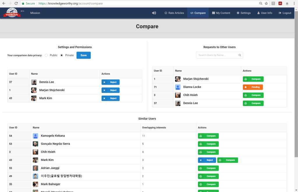
Today, when you go to a conference alongside thousands of conference-goers, finding new collaborators is almost entirely a matter of blind luck, tedious scouting prep, or your idiosyncratic professional clique. Instead imagine attending a conference workshop and getting a real-time push notification that there’s somebody else at the conference with similar Knowledge Taste as you. And that person also simultaneously gets a notification about you. If you both decide to meet, user identities and pictures are revealed and you can say “hi”! Such GPS-based “Tinder-like” functionality is the next step on KW.
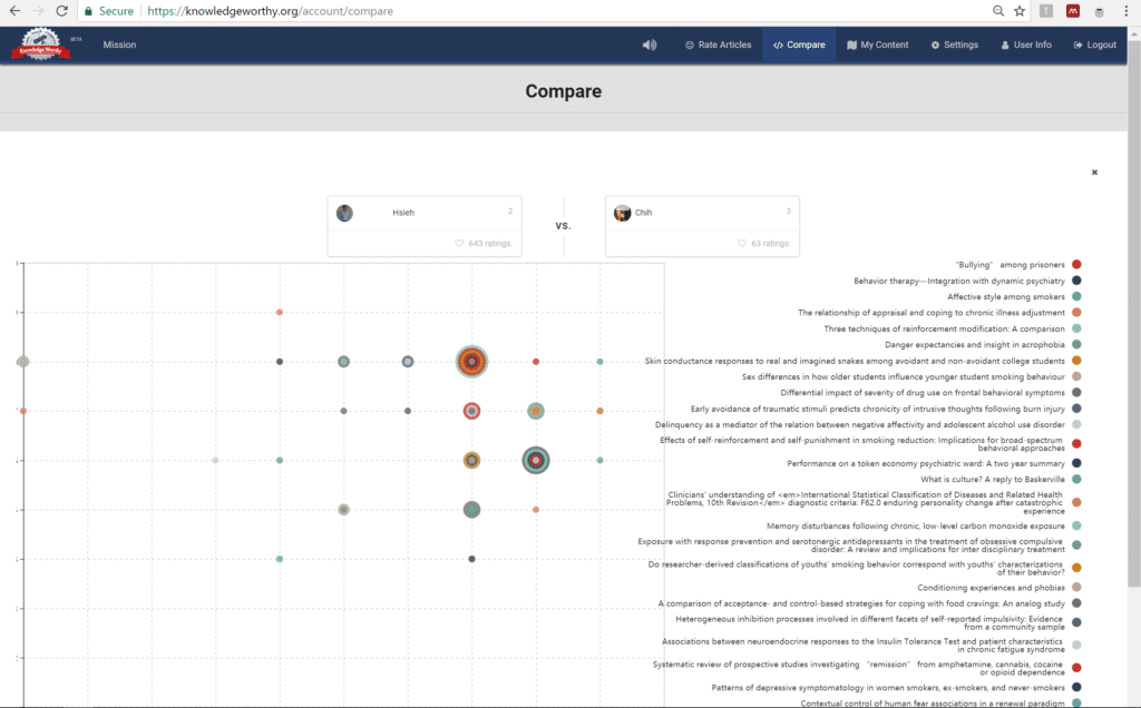
Overall, KW’s mission relates heavily to knowledge awareness and science/arts/humanities communication. This beta is the first baby step for our team of co-founders. Hard at work to develop a cool website, our members have academic backgrounds in engineering, social science, humanities, and computer science, currently hailing from American, European, and Asian institutions. It has truly been a multinational effort.
We hope you join us.
-Cofounders of KnowledgeWorthy.org
Error: Contact form not found.

